The whole rubric is too much. One idea, two ideas, two ideas with elaboration. I mean, it’s too much in one. You need to piece that [data rubric] out. That’s too much. This [visualization] isn’t going to be accurate. Sorry. … What we would break it down to, what is meaningful to us, is not represented here. It isn’t useful for a teacher to make a plan. – Dorothy (pseudonym), sixth-grade teacher.
This quotation from a partner teacher captures a complex set of tensions surrounding teachers’ interactions with data visualizations. Her reaction swiftly set the tone during one collaborative data session between our research team and partner K-12 teachers.
In the United States, teachers are increasingly expected to analyze data to improve instructional practices and student learning experiences (Bertrand & Marsh, 2015; Coburn & Turner, 2012; Farrell & Marsh, 2016a). Despite investments in policy, practice, research, and data tools, researchers often find difficulty helping teachers move away from mere awareness of data and toward deeper understanding that relates to pedagogical decisions (Few, 2006; Jivet et al., 2017; 2018; Verbert et al., 2013; Wardrip & Herman, 2018). Enduring questions remain about how to better support educators to effectively utilize technologies such as data visualizations and dashboards in their teaching practice.
Emerging fields such as learning analytics (LA) and human-computer interaction (HCI) focus on the potential for data visualizations, dashboards, and new representations of learning data to drive this instructional improvement process (Alhadad, 2018; Datnow et al., 2012; Wardrip & Herman, 2018). From these fields, designers are increasingly turning to human-centered and participatory design approaches to better align data visualizations with educators’ needs and contexts (Ahn et al., 2019; Buckingham Shum et al., 2019; Gibson & Martinez-Maldonado, 2017). These studies suggest that engaging educators in the design process itself, by including their participation in the creation of data, may provide a deeper connection to data use. In particular, helping individuals develop more agency with data is an emerging hypothesis (Peck et al., 2019).
Education researchers are also beginning to document how the types of data that educators interact with have major implications for the kinds of classroom decisions they are apt to pursue (Bertrand & Marsh, 2015; Farrell & Marsh, 2016a). For example, standardized test score data is often unhelpful for making detailed pedagogical decisions, but more practical metrics of student learning performance that are locally relevant to teachers can be more directly tied to instructional practices (Yeager et al., 2013). In addition, researchers find that internal data, or information that teachers collect themselves and perceive as most relevant to their practice goals, is more likely to be used than external data that is imposed on them (Farrell & Marsh, 2016a; Wardrip & Shapiro, 2016).
These studies hint at the notion that fostering agency with data – such as choosing data that is relevant and having a say in its production – may be an important component of supporting teachers’ understanding of education data. However, few studies exist to provide empirical evidence about these implicit hypotheses. Even fewer studies offer models or designs for how to facilitate agency-developing experiences for educators that can respect the time and resource constraints many teachers face in their daily work.
This paper is a report of results from a design experiment that explored whether a simple intervention to engage preservice teachers in participatory design around education data is related to deeper understanding and connection with that data. To ground the study, we reviewed literature in education, LA, and HCI research to outline the complex challenge of fostering positive change in teaching practices with data visualization tools. Highlighted in the following section are the ways different features are hypothesized to support teachers’ data use, such as (a) the kind of data teachers use, (b) data visualization tools, (c) fostering data interpretation, and finally (d) an underexplored concept of developing teachers’ agency with data.
We designed and facilitated a simple, light-touch experiment with the goal of understanding whether spending more time developing agency versus traditional teacher experiences around data skills (e.g., learning how to interpret graphs and charts) had discernable impacts on how preservice teachers understood a given data visualization. We conducted the study with preservice teachers because the literature on how to provide rich experiences with data for this population has been scarce, despite researchers’ calls to create opportunities to analyze and interpret data for educators early in their career.
Our results provide empirical evidence that different experiences with data (developing agency vs. data interpretation skills) result in distinct ways that teachers perceive their connections with education data. The implications are substantial, as researchers and practitioners seek better ways to support teachers and their interactions with education data (Bertrand & Marsh, 2015).
This study also provides design ideas for ways to promote teacher agency specifically with education data. Our findings offer promising evidence that even simple, designed-experiences may help educators connect more deeply with data, and these findings have major implications as researchers seek to find more effective ways to codesign data experiences with teachers (Dollinger & Lodge, 2018; Knight et al., 2013), improve practices in educational settings, and help to realize the ideal vision where educators can utilize data to inform their practice and benefit student learning.
Related Work
Our project drew inspiration from an interdisciplinary set of fields. In education research, numerous studies observe the difficulty of using data to influence reflective teaching practices. Relatedly, the LA field has turned to strategies such as participatory design to better tune analytics to users’ needs to make data more usable for educators. In HCI, researchers have focused on other general contexts of data use (e.g., in journalism, diverse populations engaging with public data, and business and nonprofit settings), and offer broader ideas for ways to promote sensemaking and interpretation. In particular, we explored the notion of agency in building personal connections with data.
Education Research: Identifying Challenges Around Data in K-12 Teacher Practice
Teachers employ a range of data (e.g., state assessment results, grade-level benchmark tests, and student work) to make instructional decisions in the classroom or organizational decisions for their school (Coburn & Turner, 2011; Wayman & Stringfield, 2006). Different forms of data visualization are prevalent in education, including assessments of student understanding, metrics of students’ engagement with tasks, or documentation of teaching (Schifter et al., 2014; Tissenbaum et al., 2016; Verbert et al., 2014). Despite the diversity of contexts and data types that are present in education settings, a core assumption – in almost all of this work – is that if data are processed and transformed into usable information, educators will make relevant interpretations and instructional decisions (Farrell & Marsh, 2016b; Mandinach & Honey, 2008).
Many studies have found, however, that teachers interact with data in limited ways (Coburn & Turner, 2011; Farrell & Marsh, 2016a; Marsh & Farrell, 2015). School context and culture set the conditions under which teachers may interact with data (Piety, 2019). For example, in the United States, high accountability pressures – where teachers and schools may be penalized by the government for low student performance – may foster negative teacher reactions to data. Teachers in schools where data are tied to high-stakes evaluation may be more concerned with how data will lead to compliance on accountability requirements (Anderson et al., 2010).
Teachers may also interpret data in counterproductive ways that have negative implications for student learning, such as embracing a deficit view of student abilities or overusing test preparation strategies (Bertrand & Marsh, 2015; Farrell & Marsh, 2016a; Marsh et al., 2016). School leaders, principals, instructional coaches, or other experienced teachers may also influence whether and how teachers experience data (Farrell & Marsh, 2016a; Kerr et al., 2006; Marsh & Farrell, 2015).
Data Literacy
Educators need to develop competencies to understand different data types and concepts (e.g., correlation, causal attributions, and trend) and to diagnose student learning needs based on the data they are seeing (Kerr et al., 2006; Mandinach & Honey, 2008; Schildkamp & Kuiper, 2010; Young, 2006). Interpreting graphs is a complex task that involves recognition of the visual characteristics of graph (e.g., format, legend, and color), knowledge of graphs, and a priori knowledge of the content that the graph depicts (Glazer, 2011; Shah & Hoeffner, 2002; Simon, 2017). Viewers need to encode a particular visualization with its underlying conceptual meanings, such as associating the lines connecting two points with trends (Shah & Hoeffner, 2002).
Even if the viewers recognize the graph characteristics, prior expectations may lead to biases and misinterpretations (Bowen & Roth, 2005; Glazer, 2011). For example, viewers are more likely to develop a simplistic understanding of line graphs: focusing on the trends along the axes and failing to incorporate additional dimensions into their interpretation when more variables are included in the graphs (Shah & Carpenter, 1995). Another example is the interpretation of scientific errors: preservice and secondary science teachers who are used to viewing representations as finite often have difficulties interpreting random variations and uncertainties (Bowen & Roth, 2005).
In addition to graph comprehension, educators need pedagogical data literacy (Mandinach, 2012; Mandinach & Gummer, 2013) or instructional decision making (Means et al., 2011) to develop actionable insights from data. Data literacy for educators encompasses an array of skills: develop hypotheses, collect and interpret multiple sources of data, and plan action based on data (Mandinach, 2012). Educators must also understand how data relate to the learning objectives of their content domains, assess student learning needs, and devise insights to select instructional strategies (Mandinach & Gummer, 2013, 2016).
Researchers of pedagogical data literacy have underscored the need to provide training for data interpretation (e.g., skills in interpreting graphs, charts, statistics, etc., and drawing inferences for instruction) for current as well as preservice teachers (Mandinach & Honey, 2008). Given the increasing focus on data interpretation for educators in training programs (Duncan, 2010; Mandinach & Gummer, 2015), scholars have argued that educators should already engage in data interpretation skills before they complete their training (Mandinach & Gummer, 2016). However, the research on preservice teachers’ experiences with interpreting data during their training is limited to training teachers with standardized assessment data, versus other data types such as student-produced artifacts (Mandinach & Jimerson, 2016; Reeves & Honig, 2015; Reynolds et al., 2019). Limited research has explored the design and implementation of experiences for preservice teachers to practice interpreting local data and drawing inferences from other data types and granular levels (individual students, classes, and schools; Mandinach & Gummer, 2016).
Learning Analytics
In recent years, LA researchers have called for data visualization design to be implemented in actual settings with educators (Ahn et al., 2019; Dollinger et al., 2019; Dollinger & Lodge, 2018; Tissenbaum & Slotta, 2019). The choices of which data to collect and how they are represented (i.e., format, focus, and aggregation level) need to be explored in collaboration with educators if before visualizations are likely to be employed meaningfully (Dollinger & Lodge, 2018).
Researchers have utilized a range of participatory design techniques to involve users in the design process (DiSalvo et al., 2017). For example, to generate design ideas and examine users’ range of responses to designs, researchers may conduct user interviews (Ahn et al., 2019; Xhakaj et al., 2016), incorporate their feedback in prototyping (Holstein et al., 2018; Holstein et al., 2017), and track users’ behavioral logs (van Leeuwen et al., 2017).
The recent evolution in LA research toward participatory design techniques illuminates an implicit conjecture in these approaches. On the one hand, engaging directly with end-users (e.g., teachers) who will use data technologies ensures that tools for teachers may be better designed for their needs. On the other hand, designers and researchers have theorized less about whether methods of participatory design may also be beneficial for teacher development as they ask educators to engage directly with data and its production. Even interviews to include teacher voices in data products or incorporating teacher feedback may provide teachers with more exposure and experiences with data in general (Dollinger et al., 2019).
Human-Computer Interaction
HCI research on data visualization offers several insights about what conditions may enable people’s deeper understanding of data. A key finding in many data visualization studies is that users need to be trained to understand how to interpret a given graph, chart, or representation. HCI research suggests that training on unfamiliar forms of data visualizations may facilitate interpretation (Grammel et al., 2010; Lee et al., 2016; Maltese et al., 2015). This general heuristic – that training and data skills are a core prerequisite for educators’ data use – is also commonplace in education research. For example, data training has been found to enhance educators’ capacity for data interpretation and use (Codding et al., 2005; Schildkamp & Kuiper, 2010; Young, 2006).
More recent studies in HCI, however, touch upon the idea that people need to build better personal connections with data to develop deeper understanding. For example, data visualization researchers have anchored visualizations in heuristics that users can identify with (Boy et al., 2017; Hullman et al., 2018; Kim et al., 2016, 2017). Studies find that unfamiliar subjects (e.g., physical measurements or spatial distances) become more understandable when paired with familiar contexts (Hullman et al., 2018; Kim et al., 2016).
Recent studies suggest that building on prior knowledge, such as making predictions of data before viewing visualizations to compare against, improves recall and comprehension (Kim et al., 2017). In addition, HCI researchers have begun to explore how users in different contexts interact with data visualizations. For example, Peck et al. (2019) found that for rural populations who engage with popular data visualizations (e.g., in newspapers or infographics), finding ways to relate personally to data captured attention and aided in interpretation.
These HCI findings have several implications for education research. For example, educators seem to be more likely to employ data to think critically about their teaching when they are able to take ownership of data collection and analysis, rather than only examining data that an outside entity (e.g., researcher, testing agency, etc.) collected (Farrell & Marsh, 2016a; Huffman & Kalnin, 2003). One potential explanation for this finding is that internally collected data have built-in prior knowledge and familiarity for teachers, which aids in data interpretation. Such findings suggest that designing ways to connect personally to new information may be an important factor in learners understanding data and using it critically.
Building Teacher Agency
A less articulated but implied conjecture is that developing agency may be another way to connect personally with data. Agency can be defined as the capacity of actors to influence a current state of affairs (Alexander, 1987), such as the capacity of teachers to implement certain instructional practices. Agency can result from a “practical-evaluative” perspective, where actors interpret the situation and select among alternatives in response to emerging demands of the present situations (Emirbayer & Mische, 1998).
Teachers practice agency, for example, in instructional contexts when they make sense of school requirements and consider choices about how to turn their insights into actions (Coburn, 2006; Datnow, 2012). In this study, we defined agency as the ability for teachers to exercise some control and choice about how data are collected, used, and visualized or represented.
The research literature provides limited guidelines about how to establish this agency. Education researchers have often situated teacher agency in the interplay between individual’s sensemaking and collegial interactions (Bridwell-Mitchell, 2015; Coburn, 2006; Datnow, 2012). Coburn (2006), for example, found that the ways in which school staff framed the tasks for implementing a reading initiative motivated and coordinated teacher practices.
Researchers have thus drawn on teachers’ individual and collaborative sensemaking to foster agency, such as implementing learning communities that focus on examining student data and action planning (Datnow, 2012). The LA and HCI literature offers suggestions that designing data visualizations with teachers may help develop personal connections. However, learning communities or codesign processes are particularly time consuming and challenging in educational contexts where dynamics such as high accountability pressures, time constraints, and power dynamics between administrators, instructional coaches, and experienced and novice teachers work to reduce agency for teachers (Anderson et al., 2010; Kerr et al., 2006; Marsh, 2012; Marsh & Farrell, 2015). Thus, there is an additional need to identify and test design ideas for supporting teachers, in ways that respect the constraints under which teachers do their daily work.
Methodology
In the study described here, we explored the following research question: Would giving preservice educators a chance to discuss the data context and a choice about what to visualize deepen their (a) data interpretation and (b) connection with the data, after accounting for baseline knowledge?
Study Context
Our research team designed an experimental set of data visualizations that were inspired by actual data in local schools that partnered with us. In one school, our partner teachers worked with a school-wide writing assessment as part of an arts-based education initiative. Students were periodically asked to analyze an image or visual artifact and write an essay about that image. The essay task asked students to reason about visual artifacts based on the following questions: “What do you see in this picture? Why do you say that? What more can you find?”
The goal of the local assessments was for teachers to observe whether students could make inferences in their writing and justify these arguments with evidence, as well as incorporate emotion in their written style. Thus, we developed ways to visualize the assessment data so teachers could easily see whether students were using inferences, evidence, and emotion (see Figure 1, Panels A, B). Our data visualizations also show “other” elements of writing which were statements that are unrelated to the images or unsupported by evidence statements.
Figure 1 Examples of Visualizations About Students’ Performance on a Local Writing Assessment
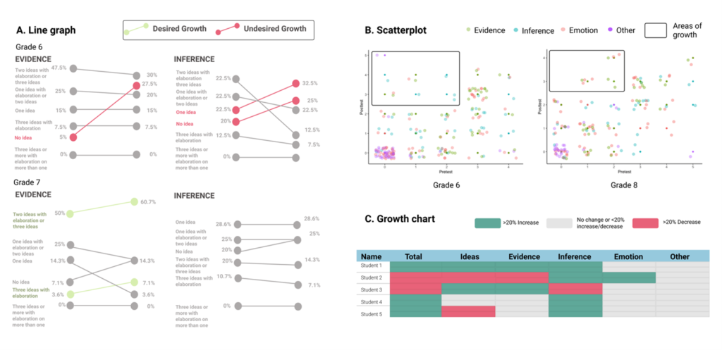
In place of more common visualizations such as bar graphs, we employed a scatter plot, line graph, and heatmap to highlight areas of growth and specific criteria for improvement in the skills of creating inferences, evidence, and emotive statements at the whole school, grade, and student level (as recommended by Knaffic, 2015). For example, the line graphs allow teachers to examine changes from pre- to posttest at the grade level.
In Panel A, Figure 1, an increase in the number of students showing “No idea” of Evidence was highlighted in red as undesirable, while an increase in “Two ideas or more with elaboration” appeared in green as desired growth. The rectangles in the scatterplot (Panel B) highlight growth areas (i.e., low at pretest, high at posttest) and suggest that Grade 6 students appeared to make the most growth in Inference (i.e., blue dots). Finally, the growth chart (Panel C) provides a more granular view at the student level, with the colors denoting the growth threshold (e.g., green = increase; gray = no change; red = decrease).
We were then interested to explore whether preservice teachers could view these visualizations and connect with the underlying data. We hypothesized that providing preservice teachers with additional experiences to discuss, coconstruct, and decide how to visualize a given piece of data would result in a deeper connection with the data itself.
Hypothesis: Preservice teachers who are given opportunities to coconstruct data and have choice in visualizations, will (a) better interpret and (b) have a deeper connection with a given piece of data, compared to teachers who only received data interpretation training.
This hypothesis has been much less explored in the research, and few guidelines have been proposed for developing this agency with preservice teachers. Thus, we engaged in a design process to glean inspiration from other situations. For example, data scientists and visualization designers themselves must develop agency with data in order to do their work. To create data products and tools, designers must learn how to translate and visually design ways to represent information. However, learning to be a data scientist or visualization designer is itself a major, long-term experience that takes many years in one’s career to develop expertise.
Training teachers to become expert data scientists or visualization designers is likely not feasible in school settings. Thus, we created a more feasible experience that educators may typically face, by engaging teachers in a collaborative discussion to coconstruct the kind of information they would like to see and have choices in what kinds of visualizations they would want to use. These simple experiences – discussing and deciding on data – represent a more light-touch and feasible process for educators. However, open questions remain as to whether providing these opportunities for educators provides benefits beyond merely training teachers on data interpretation skills.
Participants
Participants in this study were 45 preservice teachers (18 control, 27 treatment) who were enrolled in a secondary education certification program. We originally recruited 54 participants, but only 45 had complete data after the experiment (robustness checks and other analyses to account for this attrition follow). The preservice teachers came from multiple subject areas (e.g., English Language Arts, Music, and Math). The participants were enrolled in a course on Design Methods for Education at a large public university in the United States. About 57.8% of the participants self-identified as women. We designed the study as part of an existing course module around designing data for instruction.
This participant population was selected for two reasons. First, pedagogical data literacy needs to be provided not only to in-service teachers, but also to prospective teachers to connect abstract pedagogical concepts to instructional and institutional contexts (Mandinach & Gummer, 2016). Second, the participants were already engaged in talking about data through their existing course activities and had some teaching experience through their program. The preservice teachers in our study were at the end of their certification program and had already spent a year in student teaching positions. Thus, they were well-prepared to talk about data in the ways that were required in our study procedure.
Procedure
In one course session, preservice teachers were randomly divided into two groups, an agency group (n = 27) and control (n = 18). Both groups took a pretest and participated in a quick data interpretation training to understand how to read the data visualizations involved in this task. Before starting the pretest, participants read a one-paragraph description of the writing assessment that was used to generate the data in the visualizations and the coding scheme that the visualizations were based on. The pretest included measures of prior data interpretation experience that we use in our multiple regression models (see Data Sources and Measures of Data Interpretation section).
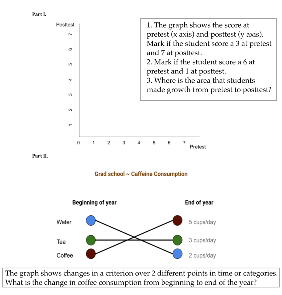
The data interpretation activity guided all participants through comprehending the various visualization types they encountered in the pre- and posttests (Figure 2). The training activity took about 15 minutes. All participants (treatment and control) were in the same room and received the same baseline activity to interpret the data visualizations in our study. The first activity (scatter plot) instructed participants to identify areas in the graph that indicate changes from pre- to posttest. The second activity (line graph) illustrated how connections between two time points may also suggest changes, such as the change in coffee consumption from the beginning to the end of the year (Figure 2).
Figure 2 Example Materials in the Data Interpretation Training
Following the data interpretation activity, the control group discussed general topics about design, data, and education for 10-minutes, then immediately took a posttest. The posttest for the control group was similar to the pretest.
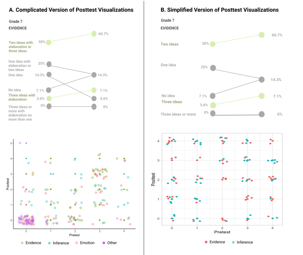
Meanwhile, the agency participants engaged in a 10-minute, structured group discussion with a facilitator. They discussed how they might revise the elements in the data visualizations, such as what information they would like to see concerning students’ abilities to make inferences, justify with evidence, and use emotion in their writing, and how this information could be simplified to suit teachers’ needs. Participants also were given opportunities to choose the kinds of data visualizations they wanted to see. For example, the group discussed whether the resulting data visualizations should be based on a “complicated” rubric that they had seen in the pretest or a simplified version they had just discussed. The simplified version took out the emotion dimension and focused on students’ abilities to make inferences and use evidence. The appendix includes an excerpt from the group discussion to illustrate the structured facilitation and the conversations that the agency participants engaged in.
Participants in the agency group provided rationales for choosing either the complicated or simplified rubric and its associated visualizations. For example, some participants said that the more detailed visualizations would provide richer feedback for instruction, while the streamlined version would assist quick decision-making. The agency group then answered a posttest with visualizations that corresponded to the choice they preferred. These two posttests versions had the same questions and measures. The only difference was that participants had a choice of which data visualization to engage with (Figure 3).
Figure 3 Two Versions of the Posttest
Data Sources
The pre- and posttests evaluated whether teachers were able to answer factual questions when interpreting data visualizations (data interpretation) and collected their self-reported perceptions as to whether they understood the categories and criteria of the assessment rubric (connections with data).
Measures of Data Interpretation
The data interpretation items consisted of nine multiple-choice questions that asked participants about a scatter plot and line graph representation (see Table 1 for the items). These questions were coded as correct (1) or incorrect (0). We developed the items for data interpretation based on prior work on visualization interpretations. The items examined tasks at increasing levels of complexity: reading data values, seeing trends, and developing predictions (as recommended in Curcio, 1987).
We used the same question format for the associated visualizations as validated instruments (Lee, Kim, & Kwon, 2016), namely retrieving value, finding clusters, finding trends, and making comparisons in scatterplot; and retrieving value, finding trends, and making correlations in line graphs. To establish content validity, we asked two external researchers in the data visualization field to review the items. Our data interpretation items had acceptable internal consistency, with Cronbach’s α of .73 from pretest and .65 at posttest. We created a composite Data Interpretation score as the sum of all correct answers to multiple-choice data interpretation items. Descriptive statistics are presented in Table 2.
We also included an open-ended item in the data interpretation assessment to examine individuals’ insights: “In your own words, describe what this line graph represents to you.” We developed codes for the open-ended responses with the following constructs: Theme, Compare, and Category.
Theme indicates whether participants stated the overall intent of the graph (e.g., graph illustrates change, improvement, or growth between pretest and posttest). Compare reveals whether participants attuned to change over time or across grade levels when they interpreted the data visualizations. Category indicates whether participants referred to the dimensions of the data (e.g., evidence, inferences, and emotion).
Examples of each code category are presented in Table 1. All three scores were coded such that 1 indicated the presence of the codes in the responses and 0 indicated an absence. Each participant response received one code for each category. We established interrater reliability for coding the open-ended responses. The second and third authors separately coded 77% of the data based on the codebook and reached substantial agreement, Cohen’s Κ = 1.00 for Theme, .77 for Compare, and 1.00 for Category. The second author coded the rest of the data.
Table 1 Assessment for Data Interpretation and Connections With Data
| Category | Item/Example |
|---|---|
| Data Interpretation | |
| Scatter plot | Identify the areas in the image where 7th grade students made no growth. |
| Identify the areas in the image where 7th grade students made growth. | |
| What is the most frequent score combination, from pre to post-test in Evidence in 6th grade? | |
| Which of the categories had more students who made growth from pre to post-test in 8th grade? | |
| Line graph | How did "One idea" score for Evidence in 6th grade change from pre to post-test? |
| Which criteria do we want to see a decrease in? | |
| Which criteria do we want to see an increase in? | |
| Where did 6th grade make desired growth in Evidence? | |
| Which grade made more growth in Evidence? | |
| Open-ended response | |
| Theme | “The graph clearly codes where students grew or regressed in the desired skills by visually mapping the changes between results in two columns.” |
| Compare | “Sixth graders became worse at critical thinking, whereas seventh graders made small improvements at evidence and emotion and no change in inference ability.” |
| Category | “Students made more desirable growth in making inferences than in using evidence.” |
| Connections with Data | |
| After looking at the graphs, do you feel like you understand what Inference means? | |
| After looking at the graphs, do you feel like you understand what "Two ideas" means? | |
| After looking at the graphs, do you feel like you understand the difference between "Three ideas" and "Three ideas or more"? | |
| After looking at the graphs, do you feel like you understand what counts as "Evidence" statements? | |
| After looking at the graphs, do you feel like you understand what the desired outcomes of the assessments are? | |
Measure of Connections With Data
We assessed participants’ self-reported perceptions about how deeply they understood the data itself, such as the definitions of constructs and intended meanings (which is different than whether they could comprehend the data visualizations) through five Likert-scale items. The items served as a proxy for the extent to which participants perceived their connections with the underlying data constructs. The items were based on a 4-point scale, ranging from 1 = Not clear at all to 4 = Totally clear. The items are outlined in Table 1.
We consulted with two fellow researchers in teacher learning and educational technology to establish the content validity of the measures. We performed exploratory factor analysis to examine the reliability of the Connections construct. All five items appeared to load on one factor and had factor loadings greater than .71. In addition, the scale had acceptable internal consistency with Cronbach’s α from the pretest = .89 and posttest = .92. Upon establishing the validity and reliability of the items, we created a composite Connections score, which is the mean (avg.) of all the items for Connections items (see Table 1).
Assumptions for normal distribution for the measures of data interpretation and connection were examined via examination of skewness and kurtosis, visual inspection (qq-plot), and Shapiro-Wilk’s normality test. Skewness ranges from -.49 to .70, and kurtosis ranges from 1.17 to 2.88. Shapiro-Wilk’s tests suggest that the data are normally distributed if p > .05: for data interpretation, the p-value for pretest control, pretest treatment, posttest control, and posttest treatment is .11, .54, .18, and .20, respectively. For connection with data, the p-value for the Shapiro-Wilk’s test is .12; .08; .27; and .06, respectively.
Analytic Strategy
To evaluate our hypothesis that preservice teachers who were randomly assigned to the agency experience would show better interpretation of the data representations and report deeper connection with the data constructs, we fit multiple regression models to predict posttest scores in data interpretation and connection by the treatment condition (i.e., agency versus control): Y(i) = Pretest(i) + AgencyTreat(i) + ε (i), where Y(i) is the posttest data interpretation score or the posttest data understanding score for a participant (i) and is predicted by their respective pretest scores and the treatment conditions. We fitted linear regression models for the continuous outcome variables (i.e., data interpretation scores for overall, scatter plot, and line graph; data connections) and logistic regression for the categorical outcome variables (i.e., responses to the open-ended data interpretation question).
We performed a Benjamini-Hochberg procedure to control for potential false discovery rate of .05 and account for multiple testing in regression analyses. In addition, since the final sample included a higher number of participants in the agency group, we conducted robustness checks that compared the control and agency groups, including participants who did not match at pre- and posttests. We found no difference in the results compared to the matched sample. Finally, we conducted sensitivity analyses given our sample size, power of .80, and type I error rate of .05. The analysis suggested that our regression models would be able to detect large effects (d = .43) but not small or medium effects of the experiment.
Findings
Results from the experiment can be found in Table 2, Table 3, and Figure 4. Together, our findings provide supportive evidence that both data interpretation training and agency-developing experiences provide different benefits for preservice teachers’ interactions with data visualizations.
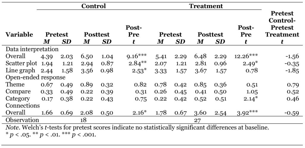
Overall, dependent t-tests for control and treatment groups suggest that all the preservice teachers’ scores in data interpretation were significantly higher at posttest than pretest (Control: Mpre = 4.39; SDpre = 2.03; Mpost = 6.50; SDpost = 1.04; t = 9.16; p < .001; Treatment: Mpre = 5.41; SDpre = 2.29; Mpost = 6.48; SDpost = 2.29;t = 12.26; p < .001). Participants in both groups also reported enhanced understanding of the data representations (Control: Mpre = 1.66; SDpre = 0.69; Mpost = 2.08; SDpost = 0.50;t = 2.16; p = .04; Treatment: Mpre = 1.78; SDpre = 0.67; Mpost = 3.60; SDpost = 2.54; t = 3.92; p < .001).
Participants in the treatment group were significantly more likely to recognize the Category behind the visualizations in their open-ended responses, Mpre = 0.22; SDpre = 0.43;Mpost = 0.52; SDpost = 0.51; t = 2.14; p = .04. This finding suggests that providing training for preservice teachers to read graphs and charts in data visualizations results in improved skills for interpreting the data. This finding is common in a wide variety of studies of data visualization and teachers, but we established that our simple data interpretation training also functioned as expected here as a baseline.
Table 2 Composite Score for Data Interpretation and Connections With Data
RQ1a: Would an Experience With Agency Deepen Interpretation Of Data?
We found that all teachers were able to interpret data equally. Teachers in the agency group did not differ from those in the control group on the posttest data interpretation score. The results mean that all teachers in our study were equally able to interpret the graphs and charts and answer factual questions from the data visualizations.
Agency group teachers scored higher on the data interpretation pretest (M = 5.41, Table 2) compared to the control group of teachers (M = 4.39), although this difference was not statistically significant. Even after controlling for any pretest differences, regression models indicated no statistically significant differences between the treatment and control groups for the overall data interpretation scores on the posttest (b = -0.44, SE = 0.53, p = .41) or the subscales for comprehending the scatter plot (b = -0.15, SE = 0.28, p = .60) and line graph (b = -0.18, SE = 0.41, p = .66). See Table 3, columns (1-3) for these results.
Table 3 Multiple Regression Results on Posttest Scores for Data Interpretation and Connections With Data
| Category | Data Interpretation | Connections | |||||
|---|---|---|---|---|---|---|---|
| Overall (1) | Scatter (2) | Line (3) | Theme (4) | Compare (5) | Category (6) | (7) | |
| b | b | b | b | b | b | b | |
| Agency group | -0.44 (0.53) | -0.15 (0.28) | -0.18 (0.41) | -0.70 (1.01) | 0.70 (0.78) | 1.35* (0.71) | 0.40* (0.18) |
| Pretest literacy | 0.41** (0.12) | ||||||
| Pretest scatter | 0.15 (0.12) | ||||||
| Pretest line | 0.33 (0.12) | ||||||
| Pretest theme | 2.17* (0.98) | ||||||
| Pretest compare | 2.60* (0.82) | ||||||
| Pretest category | 1.41* (0.83) | ||||||
| Pretest connections | 0.43** (0.13) | ||||||
| Observation | 45 | ||||||
| * p < .05. ** p < .01. *** p < .001. | |||||||
The descriptive statistics in Table 2 also make this finding clear. Both treatment (M = 6.48) and control (M = 6.50) groups had nearly identical posttest scores on the data interpretation score. This finding aligns with our study design. Note that all teachers received a quick training on how to read the various data visualizations, after taking the pretest. This light-touch data interpretation training had the effect of allowing all participants to readily interpret the graphs and charts.
Teachers in the agency group, however, were significantly more likely to identify the purposes of different data visualizations in the open-ended response (Figure 4). We found that preservice teachers in the agency group – who had a short opportunity to discuss the data rubrics and choose their data visualizations – were much more likely to identify the purposes of the information presented in a graph or chart (see Table 3, columns 6-7). For example, they were more likely to state that the data informed them about students’ abilities to make inferences and use evidence in writing. Preservice teachers in the control group – who received only data interpretation training and talked generally about design – were less likely to identify the purposes of the information (even though they were able to interpret the graphs).
Figure 4 Overall Pre- and Posttest Trends for Data Interpretation and Connections With Data, for Both Treatment and Control Groups
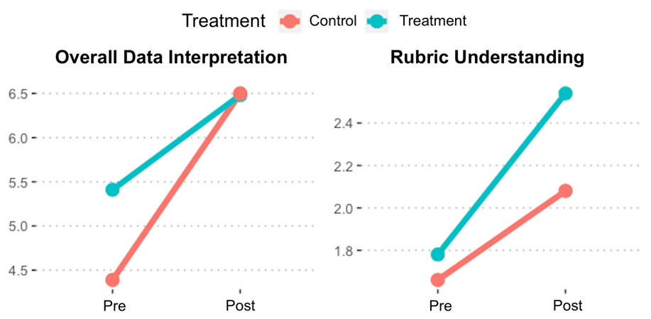
Table 3 column 6 presents results from a logistic regression model, where the binary outcome variable is whether a teacher identified a category for a data visualization. The coefficients can be interpreted as such: Participants in the agency group, who had opportunities to discuss the features of the data and had choices in data visualizations, were more likely to understand the meaning of the data representations (b = 1.35, SE = 0.71, p = .03). Converting the coefficient to a probability for more clarity of interpretation, we observe that preservice teachers in the treatment group were nearly 80% more likely to mention inferences and evidence in describing the visualizations than their peers in the control group.
RQ1b: Would an Experience With Agency Deepen Connection With Data?
Teachers in the agency group reported that they understood the meaning of the data at a significantly higher level compared to the control group. Prior to the treatment, teachers in both groups reported similar levels of connecting to the data. We observe from the data in Table 2 that the pretest average for Connections for the control group (M = 1.66) and treatment group (M = 1.78) were similar. However, posttest differences were M = 2.08 for the control group and M = 2.54 for the treatment group.
In regression models, after controlling for any pretest differences, we found that agency group participants who had the opportunity to talk through data rubrics and data visualization choices reported higher perceptions of connecting to the data (b = 0.40, SE = 0.18, p = .04; see Table 3, column 7). Overall, participants in the agency group scored 0.40 higher in self-reported data connections relative to the control group.
Discussion
Overall, this study showed that a relatively light-touch training for data interpretation can help all preservice teachers to quickly interpret and analyze data visualizations and that light-touch experiences to develop agency with data help to improve underlying understanding of the data intent and meaning. These findings are important because they validate and support prior research suggesting that data training is important to help individuals interpret data visualizations (as a baseline). The study also provides empirical evidence that engaging teachers in (a) understanding the underlying meanings and coding of data and (b) having a voice in how that data can be best represented back to them improves their foundational understanding of data visualizations.
Such findings are important because these experiences of agency (i.e., having opportunities to discuss, coconstruct, and have choice) are not typical in school settings, where time and accountability constraints often focus teachers minutely on the interpretive and transactional uses of data (Anderson et al., 2010; Marsh, 2012). Teachers are pressured to make sense of data and act on them, and one of the common occurrences in schools is for educators to reject data by voicing no-confidence in the underlying meaning and relevance of the information.
The results of this study suggest that engaging teachers as active cocreators of meaning with data, by giving them opportunities to understand and coconstruct the processing and encoding of data itself, may fruitfully foster teachers’ use of data. The results of this study offer potential implications for theorizing about other ways to design for teachers’ data agency.
This study contributes to the literature in education, HCI, and LA by exploring one way to help educators build agency with data visualizations. We operationalized agency as giving people opportunities to discuss, coconstruct meaning, and have choices in the ways that data are visualized for them. Participants in our experiment went through a structured process of understanding data and deciding ways to represent it; a simplified version of steps that data visualization designers and researchers go through in much more depth as part of their work. However, even this simple and quick opportunity to have this experience was related to positive impacts on data understanding.
In our study, the treatment group received time (albeit only 10 more minutes) to talk about the underlying meanings of the data they were viewing. Notably, this additional time did not result in better data interpretation. The control group was able to interpret the visualizations just as well. This null finding is especially important as we develop a more nuanced understanding of what types of experiences and supports help teachers in their interpretation of data.
A common hypothesis is that data interpretation training alone is the major need for teachers. If this notion were true, we would expect that the treatment group would do even better on the data interpretation assessment than the control group since they had 10 more minutes of discussion about data. However, we did not find any differences between groups. All groups were equally able to interpret visualizations after a simple baseline training, and additional time for the agency group did not change this result.
Instead, the findings show that different experiences led to different ways of understanding data. This study demonstrated that dedicating more time to build agency with practitioners may have helped the treatment group improve their personal connections to the data and visualizations. Such connections to the data are key to teachers’ motivation and adaptation of educational initiatives (Datnow, 2012).
This study’s focus on agency differs from other models that only provide training on how to read and graph data. For example, Wagner et al. (2017) found that preservice teachers’ interpretation of student progress monitoring graphs did not substantially change after receiving training on how to administer, score, and use the data in instructional decisions. Such models provide training, but not explicit discussion with teachers about how to select and represent specific data features in ways that are meaningful to teacher work.
Taken together, these results suggest that spending additional time building agency versus focusing only on data interpretation skills can be vital for supporting educators’ ability to understand and connect to data. The quality and nature of time spent with data will likely be conducive to different experiences and outcomes. Data agency experiences relate to deeper connections while data skill training relates to better interpretation.
These findings have implications for supporting preservice teachers’ experiences with data. Concurrent with the small body of work around preservice data literacy interventions (e.g., Reeves & Honig, 2015), we found significant, positive differences in preservice teachers’ data interpretation and reported connections with data visualizations, following a quick data interpretation activity. Teacher education programs should feel encouraged to incorporate these experiences into coursework and facilitate conversations around the various types of data and graphs educators may employ for instructional insights. Introducing preservice teachers to alternative data examples (such as our local data about students’ writing), beyond standardized assessment, may also help expand educators’ understanding of what counts as data and help them situate their learning and practices in practical contexts (Mandinach & Gummer, 2016).
Technology Design Implications
This study contributes to the emergent work on agency as a principle for designing data visualizations for education contexts. The LA literature has primarily centered around agency in student-facing analytics, with more theoretical propositions than design examples (Bennett & Folley, 2019; Wise, 2014) . The HCI literature has focused on design techniques to trigger affective responses and understanding of unfamiliar visualizations (Borkin et al., 2013, 2016; Boy et al., 2017; Hullman et al., 2018; Kennedy & Hill, 2018), but has only recently explored ways to foster deeper sensemaking (Kim et al., 2017).
We focused here on designing experiences with preservice teachers and providing empirical evidence that agency with data promotes deeper connections beyond basic training on data interpretation. The implications of this study are significant, because of the need to examine the differential impacts of developing educators’ agency with data in addition to common concerns about data interpretation skills.
A question for future design experiments remains: What other data agency experiences can we employ to support both preservice and in-service teachers? Our study examined a particular design of engaging preservice teachers in discussion and choices around data. We envisioned this light-touch experience as a way to respect the demands on K-12 educators’ already limited time and resources. One might contrast this simple, low-intensity experience with more in-depth options that involve deeper relationships and activities. For example, one could hypothetically require that preservice teachers also become expert data visualization designers and be more involved in the codesign of education data.
These participatory approaches are well documented in prior HCI research (Yip et al., 2016). Adoption of codesign is also gaining support in learning analytics and HCI (Dollinger & Lodge, 2018; Holstein et al., 2018). Researchers have suggested that this approach may provide important insights into educators’ practical concerns and how they may adapt the data to local instructional adjustments, beyond the reaction in in-lab user testing (Ahn et al., 2019). However, codesign can be time-demanding and costly, as it is mediated by constant interaction between educators, researchers, and designers (Ahn et al., 2019; Yip et al., 2016). More involved codesign relationships may also develop agency for teachers, but with different cost trade-offs as more resources, time, and energy are required of teacher partners.
Another approach may be to give educators agency with a limited, or more focused, set of features around data visualizations. Designers can turn to work on visualizations and analytics for students, for example, giving users the ability to specify statistical functions to examine performance in more detail (Roberts et al., 2017) or change the criteria for alternative displays of data (Bennett & Folley, 2019). A note of caution is that having too many choices can be cognitively demanding (Vohs et al., 2014), without helping practitioners arrive at useful insights for action.
In finding ways to better align data visualizations with educators’ needs and contexts, codesign approaches can involve teachers in the decision-making processes about the types of data collected and highlight how these data types can also be useful for educational institutions. Experiences with data agency can reframe the conversation around data associated with accountability – for example, data that are high stakes for institutions (e.g., test scores) but maybe low stakes for teachers (who value pedagogical, formative data).
We see promise in designs that give educators choices of data features with rich contextual understanding, while also fine-tuning experiences to ease overwhelming demand on teachers. Educators are a specific user group – with different motivations and constraints – than other users who have been studied in HCI, such as scientists or analysts.
Limitations and Future Research
Findings from this study should be interpreted with some relevant cautions. The small sample size and the study’s particular demographics of preservice teachers limit the generalizability of the findings, as well as the statistical power to detect small or medium effects of the treatment. Still, we notably observed statistically significant differences despite the small sample size of our study. Future work can validate the measures for data literacy and connection with a larger sample of preservice and in-service teachers. Also, we operationalized data agency experiences in specific ways in this study. Future research can explore other enabling conditions of agency, with multiple educational stakeholders in an array of settings, to explore their potential impact on data interpretation, understanding, and action.
Finally, we tested a designed experience that was short term by design (a simple data interpretation training and 10 minutes of discussion about data choices). Although we found immediate impacts on teachers’ reported understanding of the underlying meanings of data, we do not expect that such impacts from a small intervention alone would persist over long periods of time. Thus, we pose the question, “How could we support educators over the long-term?” This question could be a source for future studies. From our experience with educators, the most likely conjecture is that short, light-touch experiences may be needed repeatedly over a sustained period of time to develop teachers’ capacities with data interpretation, understanding, and use of data, as well as agency with data.
Educators are more likely to utilize data to improve their pedagogical approaches when they can take charge of data collection and analysis, as opposed to examining externally imposed data (Huffman & Kalnin, 2003). Our study suggests a critical question for future design work that may benefit the technology and preservice education research communities at large: What are the range of designs we could develop, around experiences and interactions, that continue to improve different teachers’ agency with data? What are the ranges of cost-benefits and trade-offs, and which designs might better align with diverse contexts to maximize success? Future design and evaluation studies have the potential to make substantial impacts on the practices of educators and the learning experiences of students.
Acknowledgments
We thank all preservice teachers who dedicated their time to support this study, as well as the local K-12 teachers and school leaders who participated in our participatory design partnership.
References
Ahn, J., Campos, F., Hays, M., & Digiacomo, D. (2019). Designing in context: Reaching beyond usability in learning analytics dashboard design. Journal of Learning Analytics, 6(2), 70–85. https://doi.org/10.18608/jla.2019.62.5
Alexander, J. C. (1987). Twenty lectures: sociological theory since World War II. Columbia University Press.
Alhadad, S. S. J. (2018). Visualizing data to support judgement, inference, and decision making in learning analytics: Insights from cognitive psychology and visualization science. Journal of Learning Analytics, 5(2), 60–85.
Anderson, S., Leithwood, K., & Strauss, T. (2010). Leading data use in schools: Organizational conditions and practices at the school and district levels. Leadership and Policy in Schools, 9(3), 292–327. https://doi.org/10.1080/15700761003731492
Bennett, L., & Folley, S. (2019). Four design principles for learner dashboards that support student agency and empowerment. Journal of Applied Research in Higher Education, JARHE-11-2018-0251. https://doi.org/10.1108/JARHE-11-2018-0251
Bertrand, M., & Marsh, J. A. (2015). Teachers’ sensemaking of data and implications for equity. American Educational Research Journal, 52(5), 861–893. https://doi.org/10.3102/0002831215599251
Borkin, M. A., Bylinskii, Z., Kim, N. W., Bainbridge, C. M., Yeh, C. S., Borkin, D., Pfister, H., & Oliva, A. (2016). Beyond memorability: Visualization recognition and recall. IEEE Transactions on Visualization and Computer Graphics, 22(1), 519–528. https://doi.org/10.1109/TVCG.2015.2467732
Borkin, M. A., Vo, A. A., Bylinskii, Z., Isola, P., Sunkavalli, S., Oliva, A., & Pfister, H. (2013). What makes a visualization memorable? IEEE Transactions on Visualization and Computer Graphics, 19(12), 2306–2315. https://doi.org/10.1109/TVCG.2013.234
Bowen, G. M., & Roth, W. M. (2005). Data and graph interpretation practices among preservice science teachers. Journal of Research in Science Teaching, 42(10), 1063–1088.
Boy, J., Pandey, A. V., Emerson, J., Satterthwaite, M., Nov, O., & Bertini, E. (2017, May). Showing people behind data. Proceedings of the 2017 CHI Conference on Human Factors in Computing Systems-CHI ’17, 5462–5474. Association for Computing Machinery. https://doi.org/10.1145/3025453.3025512
Bridwell-Mitchell, E. N. (2015). Theorizing teacher agency and reform: How institutionalized instructional practices change and persist. Sociology of Education, 88(2), 140–159.
Buckingham Shum, S., Ferguson, R., & Martinez-Maldonaldo, R. (2019). Human-centered learning analytics. Journal of Learning Analytics, 6(2), 1–9. https://doi.org/10.18608/jla.2019.62.1
Coburn, C. E. (2006). Framing the problem of reading instruction: Using frame analysis to uncover the microprocesses of policy implementation. American Educational Research Journal, 43(3), 343–349.
Coburn, C. E., & Turner, E. O. (2011). Research on data use: A framework and analysis. Measurement: Interdisciplinary Research & Perspective, 9(4), 173–206. https://doi.org/10.1080/15366367.2011.626729
Coburn, C. E., & Turner, E. O. (2012). The practice of data use: An introduction. American Journal of Education, 118(2), 99–111. https://doi.org/10.1086/663272
Codding, R. S., Skowron, J., & Pace, G. M. (2005). Back to basics: Training teachers to interpret curriculum-based measurement data and create observable and measurable objectives. Behavioral Interventions, 20(3), 165–176. https://doi.org/10.1002/bin.194
Curcio, F. R. (1987). Comprehension of mathematical relationships expressed in graphs. Journal for Research in Mathematics Education, 18(5), 382–393.
Datnow, A. (2012). Teacher agency in educational reform: Lessons from social networks research. American Journal of Education, 119(1), 193–201.
Datnow, A., Park, V., & Kennedy-Lewis, B. (2012). High school teachers’ use of data to inform instruction. Journal of Education for Students Placed at Risk, 17(4), 247–265. https://doi.org/10.1080/10824669.2012.718944
DiSalvo, B., Yip, J., Bonsignore, E., & DiSalvo, C. (2017). Participatory design for learning. In B. DiSalvo, J. Yip, E. Bonsignore, & C. DiSalvo (Eds.), Participatory design for learning (pp. 3–6). Routledge. https://doi.org/10.4324/9781315630830-2
Dollinger, M., Liu, D., Arthars, N., & Lodge, J. (2019). Working together in learning analytics towards the co-creation of value. Journal of Learning Analytics, 6(2), 10–26. https://doi.org/10.18608/jla.2019.62.2
Dollinger, M., & Lodge, J. M. (2018, March). Co-creation strategies for learning analytics. Proceedings of the 8th International Conference on Learning Analytics and Knowledge – LAK ’18, 97–101. Association for Computing Machinery. https://doi.org/10.1145/3170358.3170372
Duncan, A. (2010). Secretary Arne Duncan’s remarks to National Council for Accreditation of Teacher Education. https://www.ed.gov/news/speeches/secretary-arne-duncans-remarks-national-council-accreditation-teacher-education
Emirbayer, M., & Mische, A. (1998). What is agency? American Journal of Sociology, 103(4), 962–1023.
Farrell, C. C., & Marsh, J. A. (2016a). Contributing conditions: A qualitative comparative analysis of teachers’ instructional responses to data. Teaching and Teacher Education, 60, 398–412. https://doi.org/10.1016/J.TATE.2016.07.010
Farrell, C. C., & Marsh, J. A. (2016b). Metrics matter: How properties and perceptions of data shape teachers’ instructional responses. Educational Administration Quarterly, 52(3), 423–462. https://doi.org/10.1177/0013161X16638429
Few, S. (2006). Information dashboard design: The effective visual communication of data. O’Reilly Media.
Gibson, A., & Martinez-Maldonado, R. (2017). That dashboard looks nice, but what does it mean? Proceedings of the 29th Australian Conference on Computer-Human Interaction-OZCHI ’17, 528–532. Association for Computing Machinery. https://doi.org/10.1145/3152771.3156171
Glazer, N. (2011). Challenges with graph interpretation: A review of the literature. Studies in Science Education, 47(2), 183-210.
Grammel, L., Tory, M., & Storey, M. (2010). How information visualization novices construct visualizations. IEEE Transactions on Visualization and Computer Graphics, 16(6), 943–952. https://doi.org/10.1109/TVCG.2010.164
Holstein, K., Hong, G., Tegene, M., McLaren, B. M., & Aleven, V. (2018). The classroom as a dashboard. Proceedings of the 8th International Conference on Learning Analytics and Knowledge-LAK ’18, 79–88. Association for Computing Machinery. https://doi.org/10.1145/3170358.3170377
Holstein, K., McLaren, B. M., & Aleven, V. (2017). SPACLE. Proceedings of the 7th International Learning Analytics & Knowledge Conference on-LAK ’17, 358–367. Association for Computing Machinery. https://doi.org/10.1145/3027385.3027450
Huffman, D., & Kalnin, J. (2003). Collaborative inquiry to make data-based decisions in schools. Teaching and Teacher Education, 19(6), 569–580. https://doi.org/10.1016/S0742-051X(03)00054-4
Hullman, J., Kim, Y.-S., Nguyen, F., Speers, L., & Agrawala, M. (2018). Improving comprehension of measurements using concrete re-expression strategies. Proceedings of the 2018 CHI Conference on Human Factors in Computing Systems-CHI ’18, 1–12. Association for Computing Machinery. https://doi.org/10.1145/3173574.3173608
Jivet, I., Scheffel, M., Drachsler, H., & Specht, M. (2017). Awareness is not enough: Pitfalls of learning analytics dashboards in the educational practice. In L. Hendrik Drachsler, K. Verbert, J. Broisin, & M. Pérez-Sanagustín (Eds.), Proceedings of 12th European Conference on Technology Enhanced Learning, EC-TEL 2017. Springer. https://doi.org/10.1007/978-3-319-66610-5_7
Jivet, I., Scheffel, M., Specht, M., & Drachsler, H. (2018). License to evaluate. Proceedings of the 8th International Conference on Learning Analytics and Knowledge-LAK ’18, 31–40. Association for Computing Machinery. https://doi.org/10.1145/3170358.3170421
Kennedy, H., & Hill, R. L. (2018). The feeling of numbers: Emotions in everyday engagements with data and their visualisation. Sociology, 52(4), 830–848. https://doi.org/10.1177/0038038516674675
Kerr, K. A., Marsh, J. A., Ikemoto, G. S., Darilek, H., & Barney, H. (2006). Strategies to promote data use for instructional improvement: Actions, outcomes, and lessons from three urban districts. American Journal of Education, 112(4), 496–520. https://doi.org/10.1086/505057
Kim, Y.-S., Hullman, J., & Agrawala, M. (2016). Generating personalized spatial analogies for distances and areas. Proceedings of the 2016 CHI Conference on Human Factors in Computing Systems-CHI ’16, 38–48. Association for Computing Machinery. https://doi.org/10.1145/2858036.2858440
Kim, Y.-S., Reinecke, K., & Hullman, J. (2017). Explaining the Gap. Proceedings of the 2017 CHI Conference on Human Factors in Computing Systems-CHI ’17, 1375–1386. Association for Computing Machinery. https://doi.org/10.1145/3025453.3025592
Knaffic, C. N. (2015). Storytelling with data: A data visualization guide for business professionals. Wiley & Sons, Ltd.
Knight, S., Buckingham Shum, S., & Littleton, K. (2013, February 23-27). Collaborative sensemaking in learning analytics [Paper presentation]. CSCW and Education Workshop (2013): Viewing Education as a Site of Work Practice, co-located with the 16th ACM Conference on Computer Support Cooperative Work and Social Computing (CSCW 2013), San Antonio, TX, United States.http://oro.open.ac.uk/36582/
Lee, S., Kim, S.-H., Hung, Y.-H., Lam, H., Kang, Y.-A., & Yi, J. S. (2016). How do people make sense of unfamiliar visualizations?: A grounded model of novice’s information visualization sensemaking. IEEE Transactions on Visualization and Computer Graphics, 22(1), 499–508. https://doi.org/10.1109/TVCG.2015.2467195
Lee, S., Kim, S. H., & Kwon, B. C. (2016). Vlat: Development of a visualization literacy assessment test. IEEE Transactions on Visualization and Computer Graphics, 23(1), 551–560.
Maltese, A. V., Harsh, J. A., & Svetina, D. (2015). Data visualization literacy: Investigating data interpretation along the novice—expert continuum. Journal of College Science Teaching, 45(1), 84–90. https://doi.org/10.2505/4/jcst15_045_01_84
Mandinach, E. B. (2012). A perfect time for data use: Using data-driven decision making to inform practice. Educational Psychologist, 47(2), 71–85.
Mandinach, E. B., & Gummer, E. S. (2013). A systemic view of implementing data literacy in educator preparation. Educational Researcher, 42(1), 30–37. https://doi.org/10.3102/0013189X12459803
Mandinach, E. B., & Gummer, E. (2015). Data-driven decision making: Components of the enculturation of data use in education. Teachers College Record, 117(4), 1–8.
Mandinach, E. B., & Gummer, E. S. (2016). What does it mean for teachers to be data literate: Laying out the skills, knowledge, and dispositions. Teaching and Teacher Education, 60, 366–376. https://doi.org/10.1016/j.tate.2016.07.011
Mandinach, E. B., & Honey, M. (2008). Data-driven school improvement: Linking data and learning. Teachers College Press.
Mandinach, E. B., & Jimerson, J. B. (2016). Teachers learning how to use data: A synthesis of the issues and what is known. Teaching and Teacher Education, 60, 452–457. https://doi.org/10.1016/j.tate.2016.07.009
Marsh, J. (2012). Interventions promoting educators’ use of data: Research insights and gaps. Teachers College Record, 114(11), 1–48. https://www.tcrecord.org/content.asp?contentid=16805
Marsh, J. A., & Farrell, C. C. (2015). How leaders can support teachers with data-driven decision making. Educational Management Administration & Leadership, 43(2), 269–289. https://doi.org/10.1177/1741143214537229
Marsh, J. A., Farrell, C. C., & Bertrand, M. (2016). Trickle-down accountability. Educational Policy, 30(2), 243–280. https://doi.org/10.1177/0895904814531653
Means, B., Chen, E., DeBarger, A., & Padilla, C. (2011). Teachers’ ability to use data to inform instruction: Challenges and supports. Office of Planning, Evaluation and Policy Development, US Department of Education. https://eric.ed.gov/?id=ED516494
Peck, E. M., Ayuso, S. E., & El-Etr, O. (2019). Data is personal. Proceedings of the 2019 CHI Conference on Human Factors in Computing Systems-CHI ’19, 1–12. Association for Computing Machinery. https://doi.org/10.1145/3290605.3300474
Piety, P. J. (2019). Components, infrastructures, and capacity: The quest for the impact of actionable data use on P-20 educator practice. Review of Research in Education, 43(1), 394–421. https://doi.org/10.3102/0091732X18821116
Reeves, T. D., & Honig, S. L. (2015). A classroom data literacy intervention for preservice teachers. Teaching and Teacher Education, 50, 90–101. https://doi.org/10.1016/j.tate.2015.05.007
Reynolds, K. A., Triant, J. H., & Reeves, T. D. (2019). Patterns in how preservice elementary teachers formulate evidence-based claims about student cognition. Journal of Education for Teaching, 45(2), 140–154. https://doi.org/10.1080/02607476.2018.1548170
Roberts, L. D., Howell, J. A., & Seaman, K. (2017). Give me a customizable dashboard: Personalized learning analytics dashboards in higher education. Technology, Knowledge and Learning, 22(3), 317–333. https://doi.org/10.1007/s10758-017-9316-1
Schifter, C., Natarajan, U., Ketelhut, D. J., & Kirchgessner, A. (2014). Data-driven decision-making: Facilitating teacher use of student data to inform classroom instruction. Contemporary Issues in Technology and Teacher Education, 14(4), 419–432. https://citejournal.org/volume-14/issue-4-14/science/data-driven-decision-making-facilitating-teacher-use-of-student-data-to-inform-classroom-instruction
Schildkamp, K., & Kuiper, W. (2010). Data-informed curriculum reform: Which data, what purposes, and promoting and hindering factors. Teaching and Teacher Education, 26(3), 482–496. https://doi.org/10.1016/J.TATE.2009.06.007
Shah, P., & Carpenter, P. A. (1995). Conceptual limitations in comprehending line graphs. Journal of Experimental Psychology: General, 124(1), 43.
Shah, P., & Hoeffner, J. (2002). Review of graph comprehension research: Implications for instruction. Educational Psychology Review, 14(1), 47–69.
Simon, J. (2017). A priori knowledge in learning analytics. In A. Peña-Ayala (Ed.), Learning analytics: Fundaments, applications, and trends (pp. 199–227). Springer.
Tissenbaum, M., Matuk, C., Berland, M., Lyons, L., Cocco, F., Linn, M., Plass, J. L., Hajny, N., Olsen, A. Schwendimann, B., Boroujeni, M. S., Slotta, J. D., Vitale, J. Gerard, L., & Dillenbourg, P. (2016). Real-time visualization of student activities to support classroom orchestration. International Society of Learning Sciences. https://repository.isls.org//handle/1/382
Tissenbaum, M., & Slotta, J. (2019). Supporting classroom orchestration with real-time feedback: A role for teacher dashboards and real-time agents. International Journal of Computer-Supported Collaborative Learning, 14(3), 325–351. https://doi.org/10.1007/s11412-019-09306-1
van Leeuwen, A., van Wermeskerken, M., Erkens, G., & Rummel, N. (2017). Measuring teacher sense making strategies of learning analytics: a case study. Learning: Research and Practice, 3(1), 42–58. https://doi.org/10.1080/23735082.2017.1284252
Verbert, K., Duval, E., Klerkx, J., Govaerts, S., & Santos, J. L. (2013). Learning analytics dashboard applications. American Behavioral Scientist, 57(10), 1500–1509. https://doi.org/10.1177/0002764213479363
Verbert, K., Govaerts, S., Duval, E., Santos, J. L., Van Assche, F., Parra, G., & Klerkx, J. (2014). Learning dashboards: an overview and future research opportunities. Personal and Ubiquitous Computing, 18(6), 1499–1514. https://doi.org/10.1007/s00779-013-0751-2
Vohs, K. D., Baumeister, R. F., Schmeichel, B. J., Twenge, J. M., Nelson, N. M., & Tice, D. M. (2014). Making choices impairs subsequent self-control: A limited-resource account of decision making, self-regulation, and active initiative. Motivation Science, 1(S), 19–42. https://doi.org/10.1037/2333-8113.1.S.19
Wagner, D. L., Hammerschmidt‐Snidarich, S. M., Espin, C. A., Seifert, K., & McMaster, K. L. (2017). Pre‐service teachers’ interpretation of CBM progress monitoring data. Learning Disabilities Research & Practice, 32(1), 22–31.
Wardrip, P. S., & Herman, P. (2018). “We’re keeping on top of the students”: Making sense of test data with more informal data in a grade-level instructional team. Teacher Development, 22(1), 31–50. https://doi.org/10.1080/13664530.2017.1308428
Wardrip, P. S., & Shapiro, R. B. (2016). Digital media and data: Using and designing technologies to support learning in practice. Learning, Media and Technology, 41(2), 187-192. https://doi.org/10.1080/17439884.2016.1160929
Wayman, J. C., & Stringfield, S. (2006). Data use for school improvement: School practices and research perspectives. American Journal of Education, 112(4), 463–468. https://doi.org/10.1086/505055
Wise, A. F. (2014). Designing pedagogical interventions to support student use of learning analytics. Proceedings of the Fourth International Conference on Learning Analytics and Knowledge-LAK ’14, 203–211. Assocation for Computing Machinery. https://doi.org/10.1145/2567574.2567588
Xhakaj, F., Aleven, V., & McLaren, B. M. (2016). How teachers use data to help students learn: Contextual inquiry for the design of a dashboard. In K. Verbert, M. Sharples, T. & Klobučar (Eds.), Adaptive and Adaptable Learning. EC-TEL 2016. Lecture Notes in Computer Science (Vol. 9891). Springer, Cham. https://doi.org/10.1007/978-3-319-45153-4_26
Yeager, D., Bryk, A., Muhich, J., Hausman, H., & Morales, L. (2013). Practical measurement. Carnegie Foundation for the Advancement of Teaching.
Yip, J. C., Clegg, T., Ahn, J., Uchidiuno, J. O., Bonsignore, E., Beck, A., Pauw, D., & Mills, K. (2016). The evolution of engagements and social bonds during child-parent co-design. Proceedings of the 2016 CHI Conference on Human Factors in Computing Systems-CHI ’16, 3607–3619. Association for Computing Machinery. https://doi.org/10.1145/2858036.2858380
Young, V. M. (2006). Teachers’ use of data: Loose coupling, agenda setting, and team norms. American Journal of Education, 112(4), 521–548. https://doi.org/10.1086/505058
Appendix
Example Discussion Excerpts in the Agency Group
| Facilitator | Imagine for your work as future teachers, which visualization would be more useful for you? Do you want more information, more fine-grained details, or do you want the simpler visualization? |
|---|---|
| Student A | I mean, it depends on the students and the grade levels. If it’s 6 or 7 grades, maybe just get down to Claim and Evidence. If it’s 11 grades, you’d want more. And it depends on where they’re at. If they’re struggling with reading or AP Honors, you’d need more information. |
| Student B | I think it depends. In some schools, if you ask for evidence, it means provided support. Even though they are using evidence to support their claims, they are not making anything new, just elaboration. So I feel that dividing it into Claim and Evidence, you could lose that elaboration part. But that depends. For visual medium, their evidence is going to have to come with some interpretation because it comes from their observation. |
| Facilitator | Those are great points. I will give you a few minutes as a group to talk and decide which type of visualizations you would want to go with for this instructional context. Whichever we decide on, we will use for our next school year to bring back to the teachers. |
| Group discussion | |
| Student C | I agreed with what you said, but I feel like for this interpretive task, focusing on the other dimensions like Emotion may be subjective, and it’s better to focus on Claim and Evidence. |
| Student D | I think the plot graph was not necessarily valuable in interpreting the data, but the slope graph could show what could improve and couldn’t, and that’s more meaningful to show fine-grained details. |
| Discussion continues, and then group voted for the visualization type they’d recommend. | |
| Majority voted for the simplified version. Facilitator prompted for last thoughts. | |
| Student E | Does it have to be included in the same instance? If you throw a lot of this information at students that aren’t academically there, it’d prove to be more confusing. But if you could provide them with a shorter version, and depending on their level, you can provide more information as an extra. Because I do think this [the complicated visualization] is useful, but it is too much information. |
| Facilitator | So maybe as pre and post, what I’m hearing is focusing on the simplified version, but then for more longitudinal view you may want the fine-grained details? |
![]()